A strong mark doesn’t just identify.
It defines.
Over the past decade, I’ve developed brand identities for startups, established companies, and personal ventures alike; shaping logos, visual languages, and supporting assets into cohesive systems that resonate, scale, and endure. Each project balances strategy, collaboration, and craft to create identities that feel intentional, and are built to last.
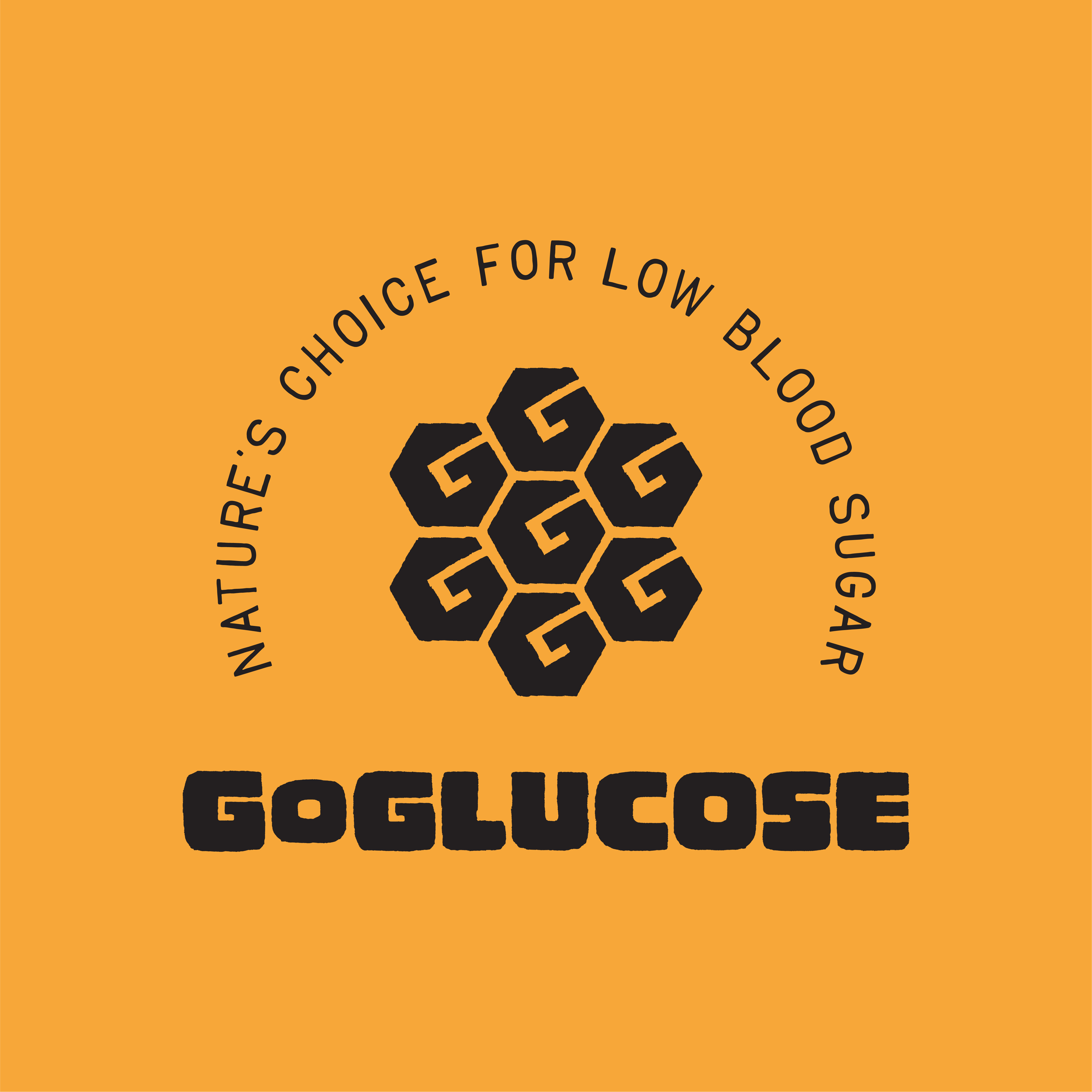
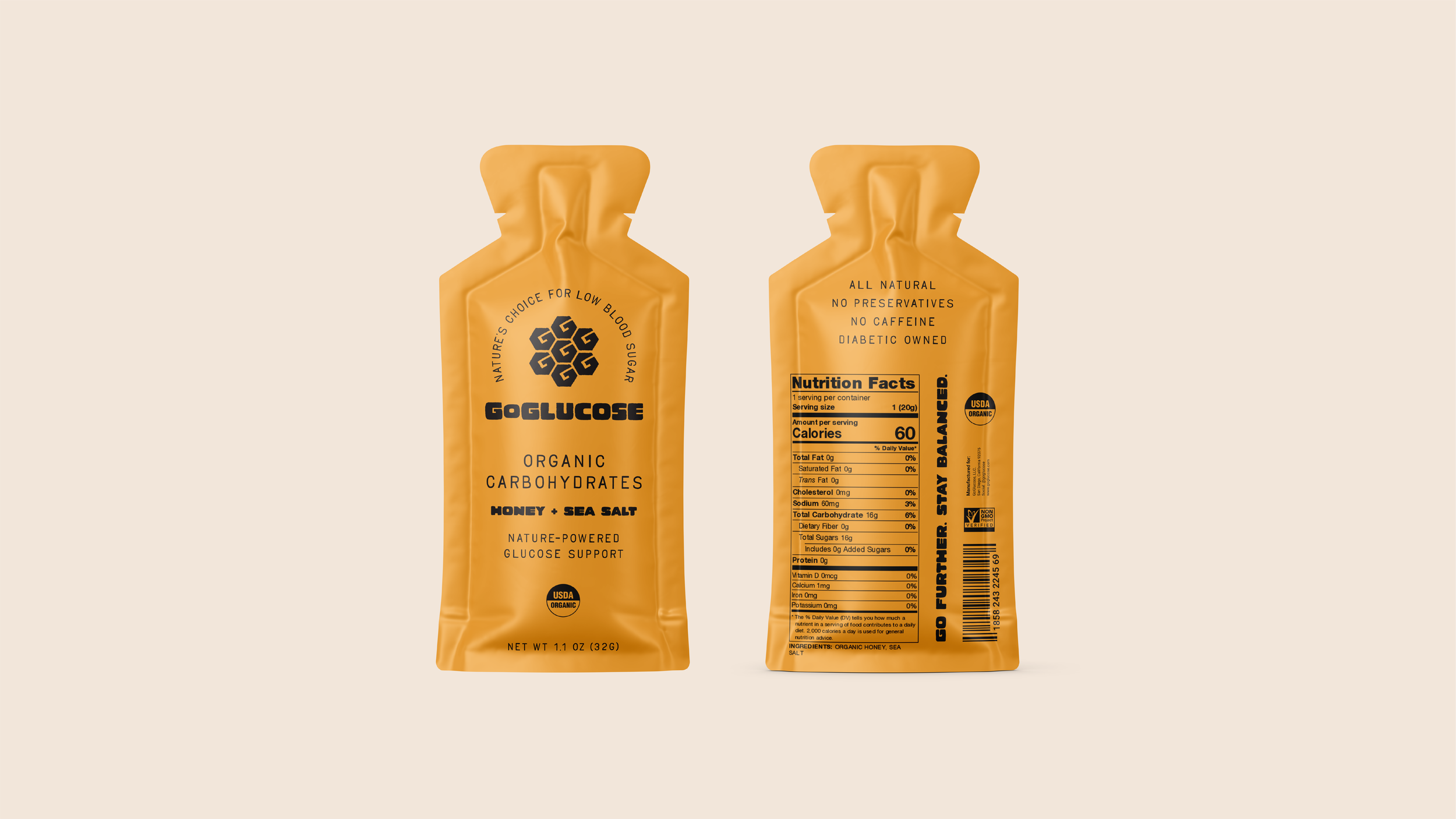
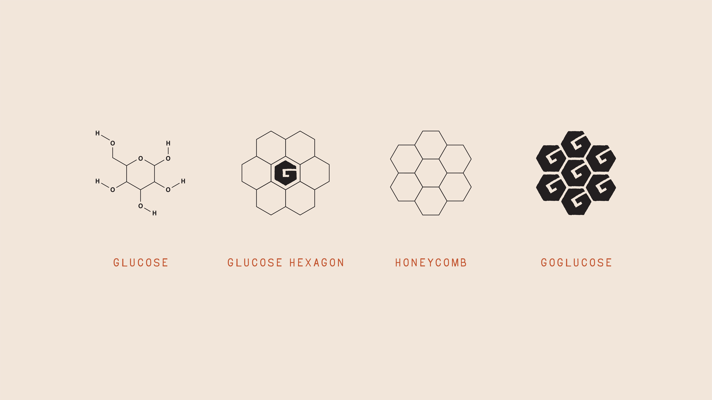
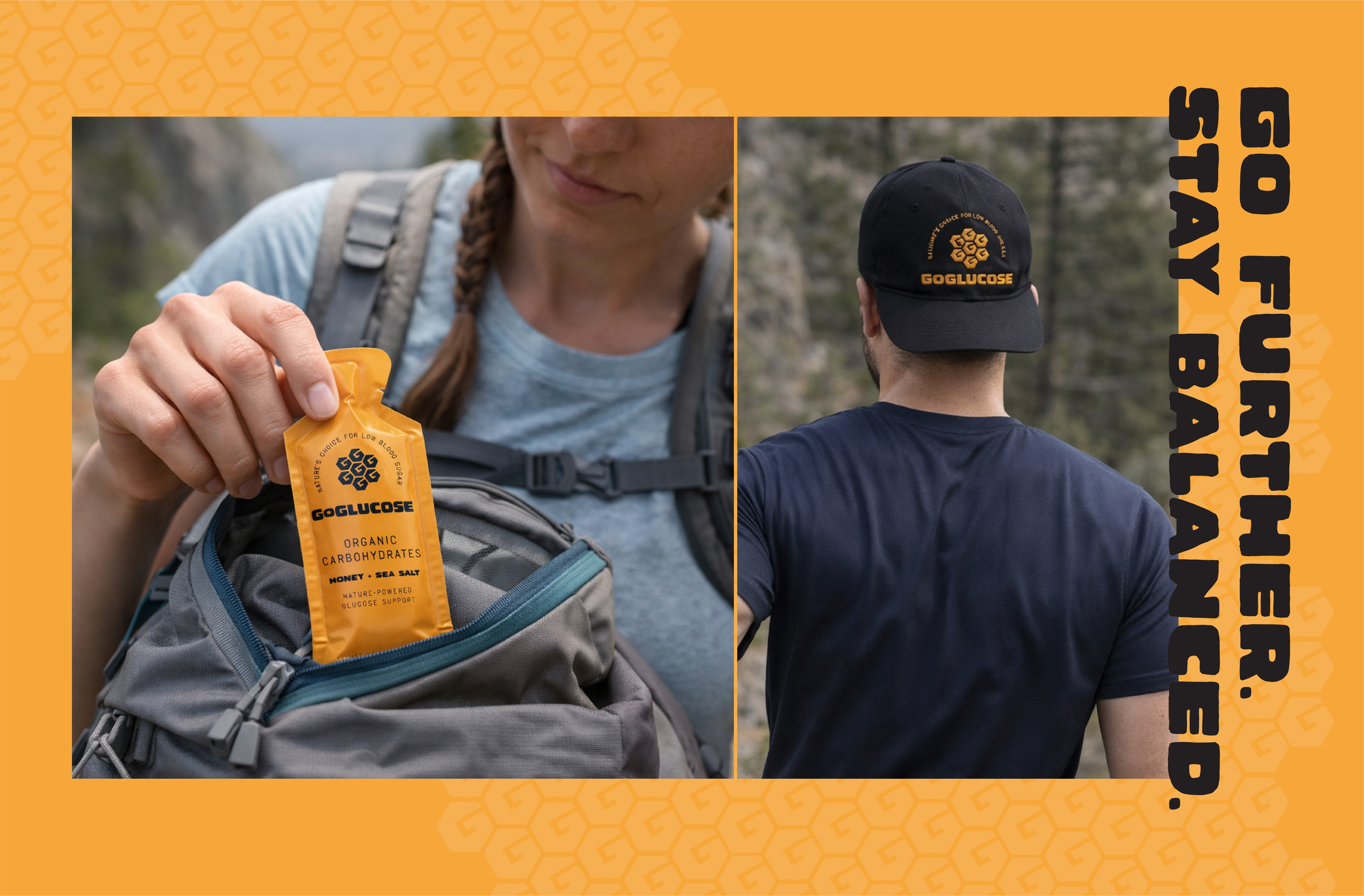
GoGlucose
It all begins with an idea. Maybe you want to launch a business. Maybe you want to turn a hobby into something more. Or maybe you have a creative project to share with the world. Whatever it is, the way you tell your story online can make all the difference.
It all begins with an idea. Maybe you want to launch a business. Maybe you want to turn a hobby into something more. Or maybe you have a creative project to share with the world. Whatever it is, the way you tell your story online can make all the difference.
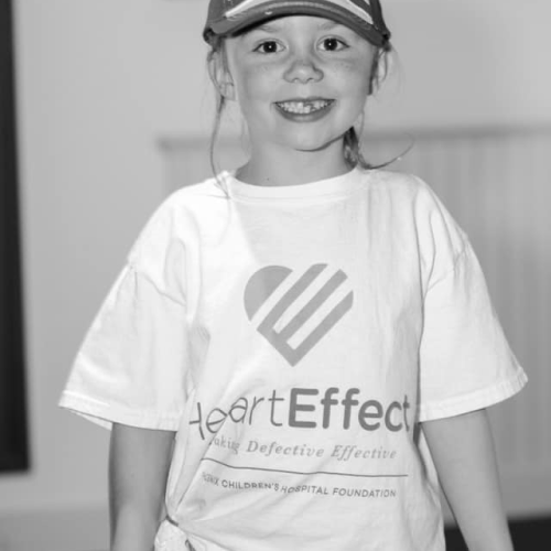
The Heart Effect
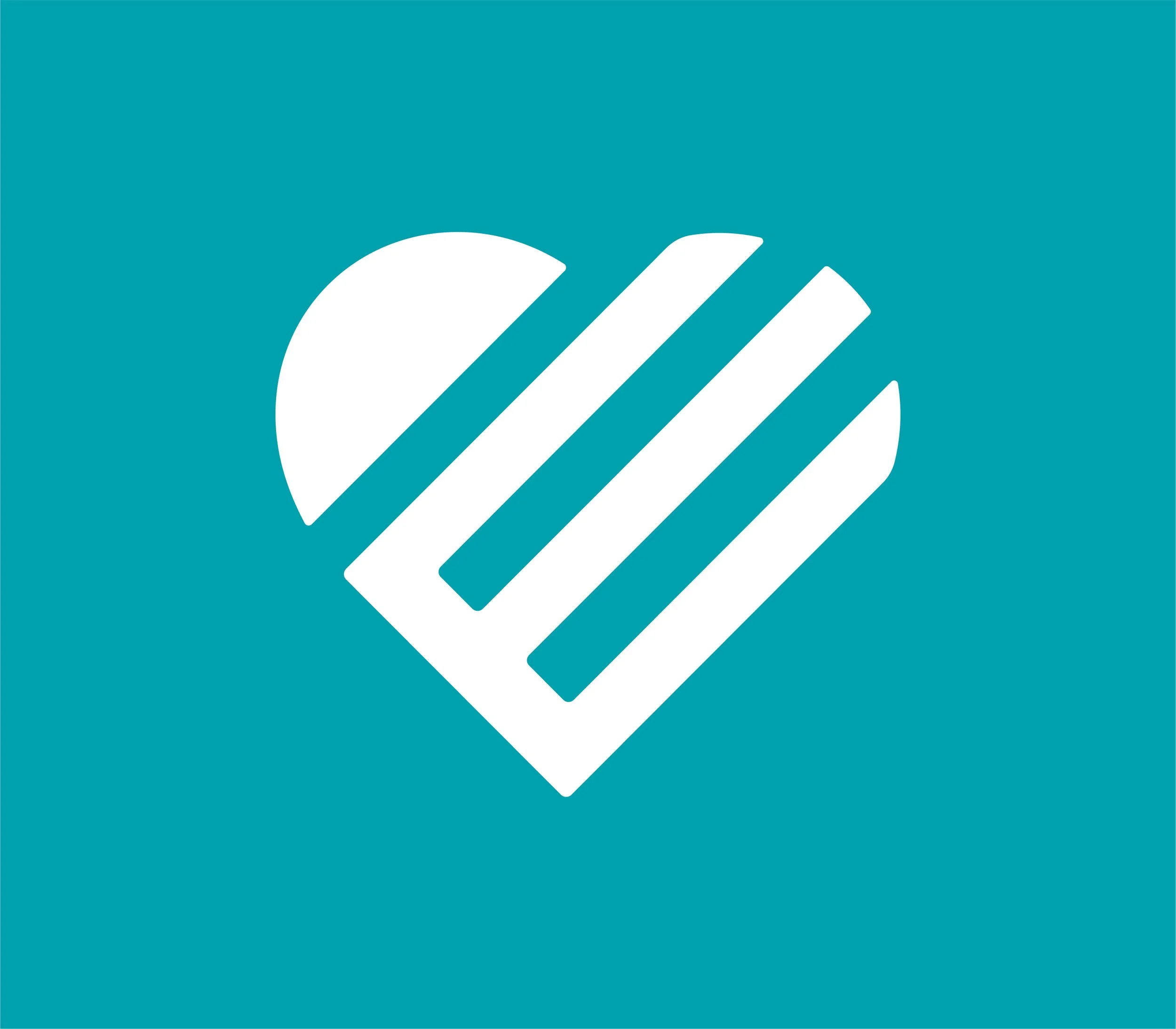
The Heart Effect is a philanthropic campaign and community initiative for Phoenix Children's Center for Heart Care, built to raise awareness, funding, and support for children with congenital heart defects — the most common birth defect, affecting roughly 1 in 100 babies. The campaign fuels life-saving surgeries, advanced medical technology, ongoing research, and critical family support services.
I developed the brand identity for The Heart Effect, designing a mark that needed to carry real emotional weight while standing up as a lasting, recognizable symbol. The logomark integrates a heart shape with the letter "E", a deliberate visual connection between the campaign's mission and its name. The goal was a clean, confident identity that could live across fundraising materials, event collateral, digital channels, and community-facing touchpoints without losing its warmth or clarity.
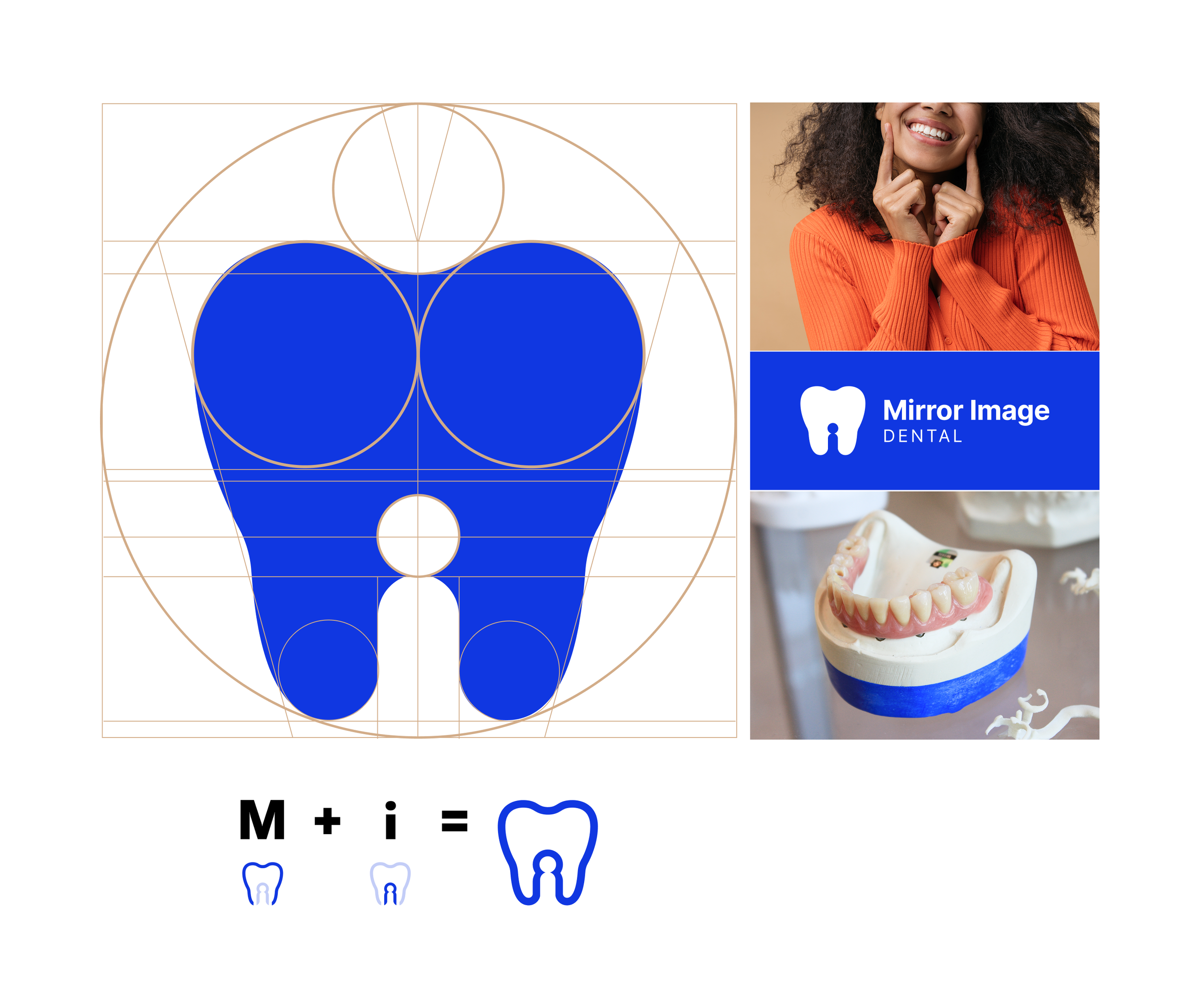
Mirror Image Dental
Mirror Image Dental is a cosmetic and medical dentistry practice in Arizona, led by twin brothers Dr. Shane and Dr. Shawn Maule. The "mirror image" name comes directly from the founders themselves, and that idea of symmetry and precision became the foundation of the entire brand identity.
I designed the logomark to be geometric, symmetrical, and layered with meaning. The outer shape of the tooth forms an "M" for Mirror, while the negative space within creates an "I" for Image, a single mark that holds both halves of the name without forcing it. The construction is built on a precise geometric grid, reinforcing the accuracy and attention to detail you'd want from a dental practice. For the color system, I anchored the brand in a rich, confident blue — trustworthy, professional, and clean — then introduced a copper-brown accent as a nod to Arizona's identity as the Copper State. It ties the practice to its home without being literal or expected, and adds warmth to what could otherwise feel clinical. The result is a brand that reads as modern and precise while carrying a sense of place and personality.
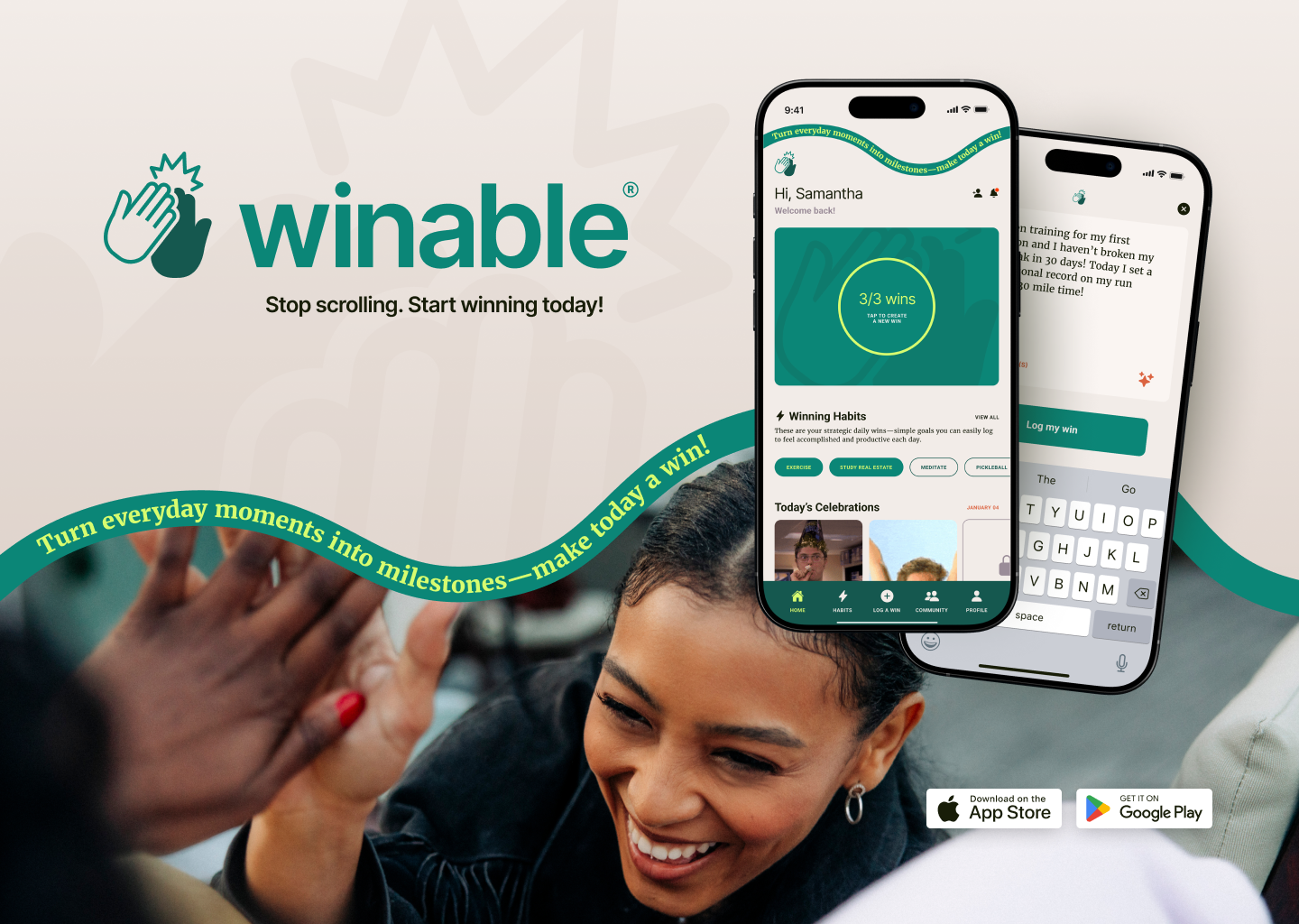
Winable
Brand Identity & Product Design
Winable is a habit-tracking app built on a simple premise: celebrating small wins builds real momentum. I co-founded Winable and led all brand, design, and UX/UI strategy from concept through launch. Taking it from idea to live product on iOS and Android in 12 months.
The brand needed to feel inviting and grounded, not gamified or aggressive. I built the visual identity around an earth-tone palette — greens, warm tans, and soft browns — chosen to feel calming and natural while reinforcing the core idea: green means go, means growth, means forward. I paired a modern sans-serif typeface with a classic serif to create a balance between contemporary clarity and familiar warmth; something that felt approachable without being disposable.
The high five became the anchor of the brand. It's celebratory, human, and immediately recognizable. The universal gesture for "you did it." The high-five mark scales cleanly as a favicon, social media avatar, and in-app loading animation, all grounded in our core green palette. Combined with raw, celebratory imagery of real moments, the identity captures what Winable is actually about: noticing progress, building habits, and making every day count.
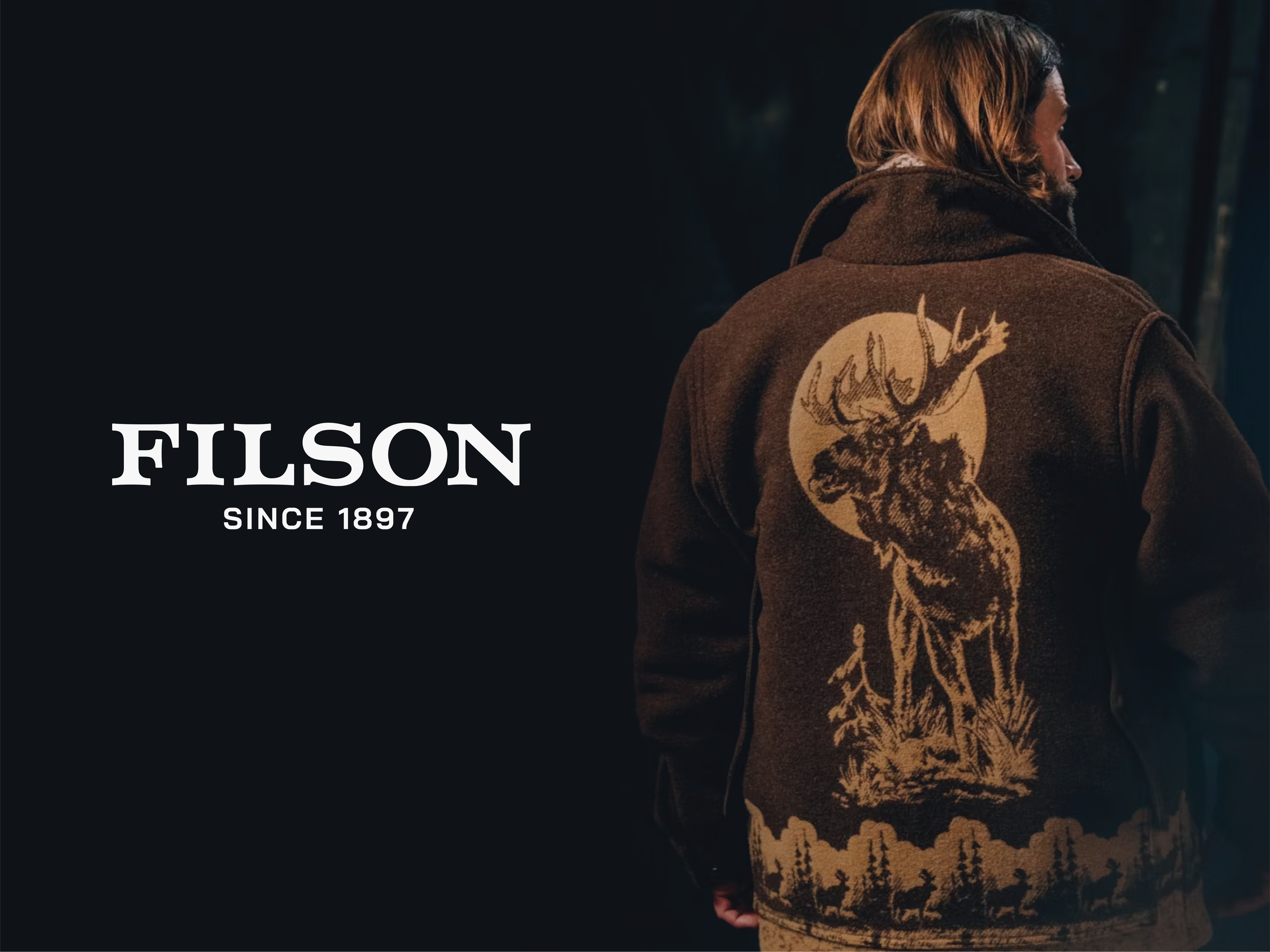
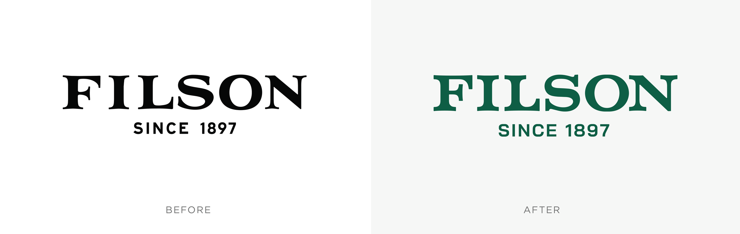
Filson
As a year-end creative exercise, I took on a self-directed redesign of the Filson logo. One of my favorite outdoor brands known for its heritage craftsmanship and no-compromise quality. While the products have always earned their reputation, I saw an opportunity to bring the same level of precision to the wordmark itself.
The redesign focused on refining what was already there rather than reinventing it. I adjusted the overall kerning for better visual rhythm, aligned the angles of the "L" leg and "S" tail for structural consistency, and developed a custom typeface that stays bold and steadfast while preserving the character traits that make the original mark recognizable. I also scaled up "Since 1897" and introduced a second custom typeface to give the founding date more presence; reinforcing the heritage story with a more timeless, trustworthy feel. The goal was never to modernize for its own sake, but to sharpen a mark that already had strong bones into something that reads with more clarity and confidence for 2025.
Logo Redesign Concept